How FR Treatment Works: A Plain-English Guide for Interior Designers

Black Faux Leather Chair

How FR Treatment Works: A Plain-English Guide for Interior Designers

What FR treatment does: It slows or prevents the ignition and spread of flame by interfering with the chemistry of combustion at the surface of the fabric.
The two main methods: Back-coating (paste applied to the reverse — standard for upholstery Crib 5) and wet padding (chemical solution applied to the whole fabric — standard for curtain treatment).
Inherent vs topical: Inherent fire resistance is a permanent property of the fibre itself. Topical treatment is applied after weaving and can degrade over time, through cleaning, or through interaction with certain dyes.
Who can certify: Only a UKAS-accredited testing laboratory. No fabric company, designer, or treatment provider can self-certify.

Most interior designers who specify FR-treated fabrics regularly have never seen the treatment process and have only a general idea of how it works. This guide explains the chemistry and process in plain language — not to make designers into treatment specialists, but to give them enough understanding to ask the right questions, spot specification risks before they become problems, and explain FR compliance confidently to clients and contractors.

For which fibres can be treated, see our FR treatment and fibre compatibility guide. For dye types and their interaction with treatment, see our dye types and FR treatment guide. For the fire standards that require treatment, see our Crib 5 guide.


Why Fabrics Need FR Treatment

All organic fibres will burn if exposed to sufficient heat and ignition energy. The chemistry of combustion in textiles follows a consistent pattern. When a fibre is heated, its polymer structure begins to break down — a process called pyrolysis. This produces flammable gases. The gases mix with oxygen from the atmosphere and ignite, producing a flame. The flame generates further heat, which causes more pyrolysis, which produces more flammable gas, which sustains and spreads the fire. This self-reinforcing cycle is what makes unprotected upholstery and curtains a serious fire hazard in public buildings.

FR treatment breaks this cycle at one or more points. Depending on the type of FR compound used, it may prevent or delay pyrolysis, reduce the quantity or flammability of the gases produced, cause the fabric to form a carbonaceous char layer that insulates the underlying structure from the heat source, or dilute the flammable gases with inert gases that cannot sustain combustion. The goal in all cases is the same: to prevent the fabric from sustaining ignition and propagating flame when exposed to the ignition sources defined in the test standard.


The Two Main Treatment Methods

Back-coating. The standard method for upholstery Crib 5 treatment. The fabric is passed through a machine that applies a paste or emulsion of FR chemicals to the reverse face of the fabric. The paste is then dried and cured to fix the compound to the backing structure. The treatment sits on the back face and does not penetrate the face yarns. This is why back-coating, when correctly applied, does not alter the appearance or handle of the face fabric.

The FR compounds used in back-coating are typically phosphorus-based or halogenated compounds — most commonly brominated flame retardants applied in a paste that also contains a binder to hold the compound to the fabric. The phosphorus compounds work primarily in the solid phase: when heated, they decompose to form phosphoric acid, which causes the polymer to char rather than produce flammable gases. The halogenated compounds work primarily in the gas phase: they release halogen radicals that interrupt the chain reactions sustaining the flame.

Back-coating adds weight to the fabric — typically a few grams per square metre — and gives the reverse a firmer, slightly stiffer character. This can be an advantage in upholstery construction because the stiffer back helps the fabric behave consistently during cutting and making-up. It does not affect the face pile character of velvet or the handle of the woven face.

Wet padding. The standard method for curtain FR treatment and some lighter upholstery fabrics. The fabric is fed through a padder — a bath of FR chemical solution followed by rollers that squeeze the solution into the fabric structure under controlled pressure — and then dried and cured. The wet pickup is controlled to achieve the required chemical loading. Because the solution penetrates the whole fabric including the face yarns, wet padding can affect handle and, critically, can interact with certain dye types. See the dye types and FR treatment guide for the specific risks.

The FR compounds used in curtain wet padding are typically water-soluble inorganic salts — ammonium phosphate or ammonium sulphate compounds — applied in aqueous solution. These are effective for cellulosic fibres and work primarily by releasing inert gases when heated that dilute the flammable gas mixture around the burning fabric. They are less suitable for upholstery because they are water-soluble and would wash out in cleaning. Back-coating compounds are insoluble and more durable.


Inherent Fire Resistance vs Topical Treatment

The distinction between inherent and topical fire resistance is commercially significant and frequently misunderstood.

Inherent fire resistance is a permanent property of the fibre itself, arising from its chemical structure. Wool and mohair have inherent fire resistance because they are protein fibres with high nitrogen and sulphur content. These elements make the fibre self-extinguishing — when the ignition source is removed, the fibre stops burning. No chemical treatment is required and no treatment can be washed away. The fire resistance is permanent for the life of the fabric.

Trevira CS is an inherently flame-retardant synthetic fibre. The flame-retardant chemical is incorporated into the polyester polymer during fibre production, not applied to the surface afterwards. Like mohair, the fire resistance is permanent and survives cleaning.

Topical treatment applies FR chemicals to the fabric after it has been woven or knitted. The chemicals are not part of the fibre structure — they sit on or within the fabric surface. This means they can potentially be degraded by cleaning, by mechanical abrasion over time, or by interaction with atmospheric pollutants or incompatible dyes. The degree to which this happens depends on the specific FR compound, the fabric construction, and the cleaning regime.

Back-coated fabrics retain their FR properties well under normal contract cleaning conditions because the back-coating compound is insoluble and mechanically fixed to the backing structure. The relevant risk is the dye interaction problem in wet-padded fabrics described in the dye types guide rather than the physical removal of the compound.

For contract environments where cleaning frequency is high — healthcare, transport seating, hotel restaurants — the distinction between inherent and topical certification carries practical weight. A fabric whose fire resistance survives aggressive cleaning without needing re-treatment or re-certification is operationally simpler and more reliably compliant over its full service life.


The Testing and Certification Process

FR treatment produces a claim of compliance. The claim must be verified by an independent test before it has any legal or commercial standing.

The test is conducted by a UKAS-accredited testing laboratory. The fabric and, for composite tests such as BS 7176, the filling material as well, are prepared and tested against the relevant ignition sources. For BS 5852 Crib 5, the ignition source is a wooden crib of defined dimensions and mass placed at the junction between a test seat and back assembly made from the fabric and a standard filling. The assembly must show no sustained flaming or progressive smouldering after the crib has burned out.

If the assembly passes, the laboratory issues a test certificate. The certificate identifies the fabric by name or reference, the filling used in the test, the standard tested against, and the test result. This certificate is the document that a designer must obtain from the fabric supplier and retain as evidence of compliance for the project.

A fabric supplier’s claim that a fabric is Crib 5 compliant without a certificate from a UKAS-accredited laboratory is not sufficient for contract specification. The Regulatory Reform (Fire Safety) Order 2005 requires the responsible person for a building to be able to demonstrate that furnishings comply with the applicable standard. A verbal assurance or a product description are not adequate evidence. The test certificate is.


What FR Treatment Cannot Do

Understanding the limits of FR treatment is as important as understanding what it achieves.

FR treatment cannot make a fabric fireproof. No textile can be made completely non-combustible by topical treatment. FR treatment reduces ignitability and slows flame spread sufficiently to meet the defined test standard. In a real fire involving sustained heat and ignition energy beyond the test conditions, treated fabric will eventually burn.

FR treatment cannot compensate for incorrect installation. A Crib 5-certified fabric used without the foam specified in the test certificate does not maintain its certification. The certificate is issued for the specific fabric and filling combination tested. Substituting a different foam invalidates the certificate for that assembly.

FR treatment does not substitute for structural fire safety. The fire resistance of the building fabric — walls, floors, doors, compartmentation — is a separate matter from the fire safety of soft furnishings. FR upholstery fabric is one element of a fire safety strategy, not a substitute for the rest of it.

FR treatment does not make a fabric immune to cleaning degradation permanently. Back-coated fabrics are durable under normal cleaning conditions, but cleaning with inappropriate chemicals — very high pH alkaline cleaners, solvents incompatible with the binder system — can over time affect the integrity of the coating. The cleaning code on the fabric data sheet should be followed.


What Happens When a Treated Fabric Is Cleaned

The question designers are most frequently asked by clients is whether the FR treatment survives cleaning. The answer depends on the treatment method and the cleaning agent.

Back-coated upholstery fabrics coded S (solvent clean only) should not be cleaned with water-based products. The binder system holding the back-coating to the fabric may be water-sensitive. Repeated water-based cleaning of an S-coded back-coated fabric can progressively weaken the adhesion of the coating. The FR compound may remain present but its mechanical adhesion to the fabric is reduced.

Back-coated fabrics coded W or WS can be spot-cleaned with water-based products without significant effect on the back-coating, provided the products are not strongly alkaline. Hotel-grade alkaline cleaners applied repeatedly can over time affect the coating. This is one of the reasons to prefer inherently fire-resistant fabrics for hotel environments with high-frequency professional cleaning. See our hotel fabric specification guide for practical guidance on this.

Wet-padded curtain fabrics treated with water-soluble inorganic salt compounds are water-sensitive by nature. The standard BS 5867 Part 2 Type B test includes a water-soak stage precisely to assess whether the treatment survives cleaning. A fabric that passes this stage has demonstrated that its treatment survives a defined level of water exposure. This does not mean the treatment is permanent under repeated laundering. For healthcare curtain applications requiring Type C certification, a more rigorous laundering pre-conditioning is included in the test.


The Treatment Supply Chain

Understanding who is responsible for what in the FR treatment supply chain helps designers avoid the most common specification failures.

The fabric supplier is responsible for knowing whether their fabric can be treated, which treatment method is appropriate, and which treatment providers have successfully treated their fabric before. A good fabric supplier maintains this information and can advise the designer before the fabric is ordered.

The treatment provider applies the FR compound and, in most cases, arranges testing through a UKAS-accredited laboratory. The treatment provider issues the test certificate. They are responsible for the quality and consistency of the treatment and for ensuring the treated fabric meets the specified standard.

The designer is responsible for specifying the correct standard for the project, confirming that the fabric supplier and treatment provider can meet it, and obtaining the test certificate before the fabric is installed. The designer cannot certify compliance — only the testing laboratory can do that — but the designer is responsible for ensuring the certified fabric is what is installed.

The contractor or upholsterer is responsible for installing the certified fabric with the certified filling. Substituting materials without re-testing invalidates the certificate. The contractor should be briefed on this before work begins.


UKAS-Accredited Treatment Providers

Textiles FR, based in Bradford, has operated since 1990 as both a flame-retardant finishing company and a UKAS-accredited test laboratory, combining treatment and independent testing under one roof. The company applies flame-retardant finishes and water and soil repellent treatments and conducts flammability testing to the British Standards covering furniture and furnishing fire safety.

Tek Treatments provides FR treatment and certification covering BS 5852 Crib 5, BS 5867 curtain standards, the IMO FTP Code for marine applications, and FAR/JAR standards for aviation.

Essex Flameproofing provides flame-retardant treatment for contract fabrics, including back-coating for upholstery and wall applications and treatment for curtains.


Quick answers

Does FR treatment change how a fabric looks or feels?
Back-coating, correctly applied to the reverse of an upholstery fabric, does not alter the appearance or handle of the face. The back will feel slightly firmer and heavier but the face pile character and surface quality are unchanged. Wet padding for curtain treatment can affect the handle of lightweight or delicate fabrics — sheers in particular may feel slightly stiffer after treatment. Any fabric where handle or appearance change would be commercially significant should be sample-treated and approved before committing to the full order.

How long does FR treatment last?
Inherent fire resistance is permanent. Topical back-coating is durable under normal contract conditions and will typically remain effective for the life of the fabric provided it is cleaned according to the cleaning code and not subjected to chemicals that attack the binder system. Wet-padded treatments are less durable and may require re-treatment after intensive cleaning or after a defined number of years in high-frequency cleaning environments. For healthcare curtains under BS 5867 Type C, re-treatment after a defined number of wash cycles is standard practice.

Can a fabric be re-treated after cleaning?
Yes, in most cases. Back-coated upholstery fabrics that have been in service for many years can typically be re-treated if the original treatment has degraded, though this requires removing the fabric from the furniture. Wet-padded curtain fabrics can be re-treated when they are laundered if the treatment has been removed. The re-treated fabric must be re-tested if a new certificate is required. Contact the original treatment provider for advice on re-treatment for specific fabrics.

What is the difference between Crib 5 and BS 7176?
BS 5852 Crib 5 is the test method — the specific ignition source and test procedure. BS 7176 is the specification standard for non-domestic upholstered seating that references Crib 5 and additionally includes the cigarette and match tests, a water-soak stage, and documentation of the specific hazard category and filling used. For hotel and contract upholstery, BS 7176 Medium Hazard is the correct standard to specify because it produces a more complete and defensible certificate than Crib 5 alone. See our Crib 5 guide and hotel fabric specification guide for full detail.

Can I self-certify that a fabric is fire retardant?
No. Only a UKAS-accredited testing laboratory can issue a valid fire test certificate. A fabric supplier, designer, treatment provider, or contractor cannot self-certify FR compliance. Under the Regulatory Reform (Fire Safety) Order 2005, the responsible person for a commercial building must be able to produce evidence of compliance. A test certificate from a UKAS-accredited laboratory is that evidence. A verbal assurance, a product description, or a supplier’s own claim of compliance are not.


For the fire standards requiring treatment, see our Crib 5 guide. For which fibres can be treated, see our FR treatment and fibre compatibility guide. For dye types and their FR interaction, see our dye types and FR treatment guide.

Request Samples

Order cutting samples of any fabric from our current collections. Trade accounts only.

Order Cuttings

Colour in Interior Design: Naming, Systems, Translation and Metamerism

Colour in Interior Design: Naming, Communication, and Specification

The specification problem: Colour names are commercial and subjective. The same underlying colour has dozens of different names across suppliers, paint brands, and clients — and no two designers will necessarily agree on what duck egg means.
The solution: Always resolve to a colour system reference — NCS for interior surfaces, RAL for metal finishes, Pantone for print and brand work — before ordering.
The hidden risk: Metamerism. A fabric that matches in the showroom under daylight may not match under the artificial light in the finished room.
The translation table below groups common UK interior design colour names by the underlying colour they typically describe, as used in 2026.

Colour is the specification decision most likely to cause a client complaint and the one most rarely handled with precision. A client approves a fabric described as blush. The designer orders a paint described as petal. The upholsterer sources a trim described as powder pink. All three are different colours. The scheme arrives on site and nothing matches because no one resolved the name to a number.

This guide covers how colour naming works and why it fails, which colour system to use and when, how to communicate colour precisely across trades, and why the same colour looks different to different people and in different light. The translation reference below groups the most common UK interior design colour names by colour family, as of 2026.


Why Colour Names Fail

Every fabric house, paint brand, and tile supplier names its own colours. The names are chosen for commercial appeal, not precision. A paint company wants Elephant’s Breath to evoke warmth and character. A fabric house wants their Biscuit to suggest luxury neutrality. Neither name tells you where the colour sits in any colour space. Both names could plausibly describe a wide range of warm mid-toned neutrals.

The problem compounds across a project. A designer specifying a scheme involving fabric from one supplier, paint from another, carpet from a third, and joinery from a fourth is working across four independent naming systems. There is no cross-reference between them. The only way to align them is to resolve every colour to a shared external reference — a colour system number — and communicate that number to every trade.

Even within a single supplier’s range, names shift. A fabric house that has offered a colour called Midnight for ten years may reformulate the dye lot, slightly alter the weave, and produce a Midnight that is measurably different from the one specified two years earlier. The name is the same. The colour is not.

The naming problem is also cultural. British designers use colour names that reflect a particular historical and landscape vocabulary — stone, slate, chalk, flint, pewter, linen, dove. American designers use a different vocabulary. European designers working in the Nordic tradition use the NCS system. A project involving international suppliers requires an explicit colour system reference to avoid compounding the naming problem across languages as well as trades.


Colour Systems: Which to Use and When

NCS — Natural Color System. The most useful colour system for interior design specification. NCS describes colours in terms of how they are perceived by the human eye, using six elementary visual colours: white, black, red, yellow, green, and blue. An NCS code such as S 3020-Y50R specifies blackness (30%), chromaticness (20%), and hue (50% toward red from yellow). The S prefix indicates the second edition of the standard. NCS is used by architects and interior designers across Europe and is the reference standard for major paint manufacturers including Jotun and Dulux Trade in their professional ranges. When specifying wall colours for a commercial interior project, NCS is the correct system to use. It allows you to communicate a precise colour to a painter, a fabric supplier, and a joinery manufacturer without relying on any of their proprietary names.

RAL. The European standard for powder coating, metalwork, and architectural finishes. RAL Classic uses four-digit codes covering approximately 215 colours. RAL 9016 is Traffic White. RAL 7016 is Anthracite Grey. When specifying metal chair frames, radiators, window frames, or any powder-coated architectural element, RAL is the correct system. Most powder coating suppliers work from RAL as their primary reference. RAL does not map directly to NCS or Pantone without conversion, and conversions are approximate rather than exact.

Pantone. The dominant colour system in graphic design, brand communication, and print production. Pantone codes are used when specifying a brand colour for print, signage, or product. In interior design, Pantone is occasionally used as a colour reference for upholstery and wallcovering suppliers who offer Pantone matching, but it is not the primary system for architectural finishes. Pantone codes appear on printed swatches and fabric samples but should not be used as the sole colour reference for a painted surface, as the translation from ink to paint is approximate.

BS 4800. The British Standard colour specification for paints used in building work. BS 4800 covers a defined set of colours identified by a code such as BS 4800 10 A 03 (a warm off-white). It is used primarily in public sector and heritage projects where British Standard compliance is specified. Many general contractors and architects working on commercial buildings in the UK will be familiar with BS 4800 references. It is a smaller palette than NCS and less commonly used for bespoke or high-design interiors.

The practical rule is: use NCS for all wall, floor, and soft furnishing colour communication on interior design projects. Use RAL for metalwork and powder-coated elements. Obtain both references where possible so that trades working in either system can match without conversion.


Metamerism: Why the Colour That Matched in the Showroom Looks Wrong on Site

Metamerism is the phenomenon by which two surfaces that appear identical under one light source appear different under another. It is one of the most common causes of colour-match complaints on interior design projects and one of the least discussed with clients in advance.

The reason it occurs is that two surfaces can reflect the same amount of light to the eye under one type of illumination while having different underlying spectral profiles. Under a different light source, the differences in spectral profile become visible. A fabric and a paint that match perfectly under the daylight of a showroom window may look visibly different under the warm tungsten halogen downlights in the finished room. Both colours are correct. The light source changed the relationship between them.

Metamerism is particularly common between natural and synthetic materials. A mohair velvet and a painted wall that match under daylight are likely to show metameric shift under artificial light because natural fibre dyes and paint pigments have different spectral curves. It is also common between fabrics from different fibre types — a cotton and a polyester in the same colourway may match under daylight and diverge under artificial light for the same reason.

The practical response is to view all fabric samples and paint samples together under the artificial light sources specified for the finished room before approving the scheme. This means reviewing the lighting specification in advance and obtaining the same lamp type for the sample viewing. Most clients and many designers view samples in daylight or under office fluorescent lighting and assume the match will hold. It often does not.

For high-stakes colour matching — a large hotel project where hundreds of chairs must match a specified wall colour across multiple rooms — commission a formal metamerism assessment from a testing laboratory before committing to production quantities.


Colour Perception Differences Between People

Approximately 8% of men and 0.5% of women have some form of colour vision deficiency. The most common type is red-green deficiency, in which the receptor cells that distinguish red from green are absent or abnormal. A person with this condition perceives red and green as variations of the same brownish yellow. This is not a minor variation — it is a fundamental difference in how approximately one in twelve male clients perceives the fabric palette a designer is presenting.

Colour vision deficiency is frequently undiagnosed. Clients who have lived with it since birth have developed compensatory strategies and may not disclose it or may not know they have it. A designer who presents a scheme relying on contrast between red-toned and green-toned neutrals — terracotta versus sage, for example — may be presenting a scheme the client cannot see as intended.

Beyond clinical deficiency, there is significant variation in how people with normal colour vision name and categorise colours. Studies have shown that colour naming is culturally and linguistically variable — what one language group calls blue, another language group divides into two separate colour categories. Two designers with normal colour vision looking at the same fabric may describe its undertone differently, and both will be accurately reporting what they see. The human visual system is not a calibrated instrument. It is a perception system shaped by language, culture, expectation, and the colours surrounding the object being observed.

In practice, this means that verbal colour descriptions are unreliable between any two people unless they are standing in front of the same physical sample under the same light at the same time. The specification implication is the same as for naming: resolve to a colour system reference and communicate physical samples, not verbal descriptions or digital images.


Colour Translation Reference: Common Interior Design Names by Family (2026)

The following groups the most frequently used colour names in UK interior design, upholstery, and decorating as of 2026, organised by the underlying colour they typically describe. Names within each group are not identical — they occupy overlapping but distinct territory — but they are commonly used interchangeably by clients, designers, and suppliers who do not share a colour system reference. The groups are a starting point for conversation, not a claim of equivalence.

Whites and near-whites. Brilliant white, pure white, chalk white, off-white, cloudy white, old white, linen white, ivory, cream, antique white, aged white, bone, parchment white, ceramic white, architectural white. These names span a wide range from cold blue-whites through warm cream-whites. A client who asks for cream and a client who asks for ivory may be describing colours a full tone apart. Always show physical samples.

Warm greiges and neutral taupes. Greige, warm grey, stone, putty, linen, parchment, oatmeal, mushroom, taupe, mole, beige, buff, calico, string, natural, jute, raffia, hessian, wheat, biscuit, driftwood, pale stone, light stone, warm stone. This is the most densely populated territory in UK interior design naming and the one most prone to miscommunication. Greige alone is used to describe colours ranging from pale warm beige to mid warm grey. Always resolve to NCS before specifying in this family.

Cool greys. Silver, lead, slate, pewter, gunmetal, graphite, charcoal grey, payne’s grey, dove grey, ash grey, mist grey, flint, pebble, smoke, zinc, concrete grey, storm grey, elephant grey, mouse. The warm-cool axis within grey is the primary source of mismatch in this family. A warm grey specified by a designer may read as brown against the cool grey chosen by a contractor for metalwork. NCS or RAL references resolve this.

Blue-greens and aquas. Duck egg, teal, peacock, kingfisher, jade blue, lagoon, aqua, eau de nil, mineral blue, verdigris, turquoise, malachite, sea green, ocean, petrol, airforce blue (with green undertone). Duck egg and teal are used interchangeably by many clients but occupy different positions — duck egg is typically a pale, muted blue-green and teal is a deeper, more saturated blue-green. Eau de nil is greener and paler than both. These distinctions are lost without a physical sample or a colour system reference.

Blues. Navy, midnight blue, ink, indigo, denim blue, storm blue, petrol (with blue undertone), prussian blue, french navy, cobalt, ultramarine, cornflower blue, wedgwood blue, china blue, powder blue, pale blue, sky blue, dusk blue, twilight blue, deep sea. Navy alone covers a range from near-black blue-black through mid blue-navy to softer slightly lighter navies. Ink and midnight typically sit at the dark end. Wedgwood and china blue sit at the lighter, cooler end.

Greens. Sage, eucalyptus, olive, khaki, moss, fern, forest green, hunter green, racing green, bottle green, dark green, heritage green, military green, lichen, oregano, artichoke, willow, soft sage, pale sage, mint, jade, malachite, emerald, jungle, avocado, apple green, pistachio. Sage is the most widely misapplied name in UK interiors. It is used to describe everything from pale grey-green through mid green-grey to distinctly green muted mid-tones. A client who asks for sage may mean any of twenty different colours.

Pinks and blushes. Blush, dusty rose, dusky pink, rose, antique rose, petal, old rose, powder pink, nude, flesh, ballet pink, candy pink, shell pink, dawn pink, cameo, clay pink, terracotta pink, blossom, peach blush, pale copper. Blush and dusty rose are frequently used as synonyms but blush typically carries a lighter, more pink tone while dusty rose sits further toward red-pink with more grey. Peach blush crosses into the orange-pink territory that can read as terracotta under warm artificial light.

Terracottas and clays. Terracotta, rust, burnt orange, sienna, burnt sienna, copper, brick red, clay, adobe, paprika, spice, cinnamon, ginger, saffron, turmeric, ochre-red. Terracotta has shifted considerably in UK design usage over 2023 to 2026, moving from a darker burnt clay toward lighter, more muted clay pinks. A fabric specified as terracotta in 2019 and a fabric specified as terracotta in 2026 may be visibly different colours.

Ochres and mustards. Ochre, mustard, turmeric, gold, amber, honey, sand, straw, hay, maize, sunflower, chartreuse (warm end), saffron, golden yellow, aged gold, antique gold, harvest. Mustard and ochre are frequently confused. Ochre is typically a more muted, earthy yellow-brown. Mustard is warmer and more saturated. Honey sits between them. Gold crosses into metallic territory that is distinct from pigment-based versions of the same tone.

Browns and taupes. Tobacco, chocolate, mahogany, walnut, chestnut, caramel, mocha, coffee, cocoa, espresso, bark, sepia, burnt umber, raw umber. Taupe, mole, beaver, warm stone, fawn, doeskin, camel, vicuna, praline, hazel, truffle. The brown-taupe family is split between the red-brown furniture tones (walnut, mahogany) and the cooler grey-brown neutrals (mole, taupe, beaver). A client who asks for camel may mean anything from a warm tan through to a dark golden brown depending on their reference point.

Blacks and near-blacks. Jet black, pure black, soft black, charcoal, anthracite, gunmetal, ink, pitch, ebony, onyx, carbon, slate black, warm black, blue-black, off-black. Off-black and near-black have become a significant design category in UK interiors. Railings (blue-black), Downpipe (blue-grey-black), and similar deep tones occupy different positions on the warm-cool axis within apparent black and will not match each other on site.


Quick answers

What is the difference between duck egg and teal?
Duck egg is typically a pale, muted blue-green with significant whiteness — it reads as a soft, quiet colour in most rooms. Teal is deeper and more saturated, with a stronger blue-green chromatic content. Some suppliers use the names interchangeably, which makes them unreliable without a physical sample. Eau de nil sits to the greener, paler side of duck egg. Petrol sits to the darker, bluer side of teal. Always view physical samples side by side rather than ordering from name descriptions alone.

What does greige mean?
Greige is a portmanteau of grey and beige, describing a neutral that sits between the two. It has become one of the most popular colour families in UK interior design since approximately 2018 and is heavily used in both residential and hospitality specification. The problem is that different suppliers use greige to describe colours spanning a significant range — from pale warm beige with barely perceptible grey, through to mid warm grey with beige undertones. There is no standard definition. Always request a physical sample and resolve to an NCS reference before ordering.

What colour system should interior designers use?
NCS is the most appropriate colour system for interior design specification in the UK and Europe. It describes colours in terms of visual perception, is used by major paint manufacturers in their professional ranges, and allows precise communication across trades without relying on proprietary colour names. RAL should be used for metalwork, powder coating, and architectural hardware. Pantone is appropriate for brand colour communication and print. BS 4800 applies to public sector and heritage projects with British Standard requirements. Always obtain an NCS reference for any colour that will be matched across multiple suppliers or trades.

What is metamerism and how does it affect fabric specification?
Metamerism is the phenomenon by which two surfaces that appear identical under one light source appear different under another. In interior specification, it most commonly occurs when a fabric approved in daylight in a showroom does not match the paint or other materials under the artificial lighting of the finished room. The underlying colours are correct — the light source changed the relationship between their spectral profiles. To avoid metameric mismatches, always view fabric and paint samples together under the same light source as the finished room before approving a scheme. For large-scale projects, a formal metamerism assessment can be commissioned from a testing laboratory.

What is sage green?
Sage is one of the most widely misapplied colour names in UK interior design. It is used by different suppliers and clients to describe colours ranging from pale grey-green (barely green, primarily grey) through to distinctly green mid-tones with visible chromatic content. The common territory is a muted, greyed green — a green that has been reduced by the addition of grey or its complementary colour until the green is soft rather than vivid. Eucalyptus, willow, and soft sage typically sit at the paler, more muted end. Lichen and oregano sit at the more complex, multi-toned end. Always use a physical sample and NCS reference when specifying any green in this family.

Why do colours look different to different people?
Two main reasons. First, approximately 8% of men and 0.5% of women have colour vision deficiency, most commonly red-green deficiency, in which red and green are perceived as variations of the same brownish tone. This is frequently undiagnosed. Second, even among people with normal colour vision, colour naming is variable — shaped by language, culture, and prior experience. Two designers with identical colour vision may describe the same fabric undertone differently and both are accurately reporting their perception. The implication for specification is consistent: verbal descriptions and digital images are unreliable. Physical samples under agreed lighting conditions are the only reliable basis for colour approval.


For guidance on colour fastness and how fabric colours perform over time, see our colour fastness and crocking guide and our light fastness and Blue Wool Scale guide.

Request Samples

Order cutting samples of any fabric from our current collections. Trade accounts only.

Order Cuttings

Faux Leather Upholstery

Brown Faux Leather Upholstery Banquette

Faux (or fake) Leather offers a great alterantive to leather. With Martindale rubs of over 100,000 this is a very safe choice for high use contract areas. It’s usually made of a pure cotton basecloth with a poly-cotton visible coating. There are many other animal skins that are mimiced in the same way and in many cases the finishes are convincing.

But why not just use leather?

Much leather production has now moved away from the West to areas with less stringent environmental laws and lower wage rates. This is where the problem lies.

Chromium based compounds are used in the tanning and curing process of real leather. They are thought to be carcinogenic as, in some European tanning factories, cancer rates were found to be up to 50% higher in workers than in the population as a whole. Furthermore there were higher incidences of Leukemia in children living in areas near the tanneries. Environmental problems are exacerbated by the siting of factories next to rivers; the significant amounts of discharge that are produced are fed into the water courses and then dispersed over wide areas. In more lowly regulated economies it is not unreasonable to believe that the situation is probably worse.

Moving towards a better leather requires that chromium use is stopped completely and that the water used in production is cleaned and re-used in the factory. Any tanins and dyes uses would preferably be plant based.

Food for thought: If you wear leather clothing on sweaty skin then chromium residues in the leather can rub off and enter the skin.

Faux Leather on doors and walls

Brown Faux Leather Upholstery Banquette

KOTHEA had two recent projects where we had to adhere Faux Leather vertically. This poses a more serious challenge than paper-based wall coverings due to both the weight of the fabric (nearly 1kg per linear metre) and the wear and tear when adhered to a door. Both installations were more involved than domestic ones as we had to consider firstly the use on a yacht in a marine environment and secondly the high levels of usage of a hotel.

So the adhesive needs to be strong.

A further set of issues to overcome are related to how the fabric might react to any chemicals in the adhesive. In both instances our fabric had a 100% cotton back coat with a vinyl mix visible layer. Superfically a conclusion could be drawn that most adhesives would be OK with the surfaces they are fastening to in these instances ie a natural wooden door and inert stone wall combined with the natural cotton back cloth. However the adhesive will almost certainly penetrate the back cloth. Becuase of this the use of a solvent based adhesive, such as Asceton, is most definately not recommended.

So the adhesive needs to be strong and water based.

After performing suitability tests in these instances we chose to use Mapei’s Adheselix VS45 . VS45 is an acrylic adhesive in water dispersion and has been used extensively by Mapei’s customers for PVC/foam wallcoverings and rubber flooring. An alternative of Adesilex G19 was also suggested for areas with more moisture but that was not necessary in these cases.

A Great Interior Designer’s Profile Would …

What Makes A Great Interior Designer Profile?

I would argue that an image is the basis of a great profile for an interior designer.

Something to WOW me and to attract me all within a second. Something that tells me more about you than perhaps words could do succinctly.

Then you’ve hooked me I might read on a bit further.

Then you would need to tell your client what kind of projects and people you work with and perhaps also how you engage and work. You might NOT even need a killer headline “Best Interior Designer In London” or you might.

What do you think?

But of course you already have done such a profile on your web site 😉

We are happy to host (no strings or ropes attached) a brief profile of your INTERIOR DESIGN or ARCHITECTURE business on this blog (https://www.KOTHEA.com) with a link back to your site. Nada. Nothing Rien. No cost. Your benefit is free advertising to subscribers to and readers of this blog and a reputable backlink to boost your site’s visibility even further.

What do we get out of it? One day you’ll buy some fabrics or cashmere throws from us. Maybe. Perhaps. Hopefully 🙂

To be clear: This is for interior designers and architects and NOT their suppliers.

Interior Designer | Brand Boost + Author Boost

Off-White Textured Upholstery on Contemporary Seating

Modern-day interior designers should know that there are a few neat tricks you can do on your website AND blog to make YOU stand out more in Google when your clients search for you or the things you create.

I’m going to take you through two DIFFERENT but related changes to your blog/website.

Company Brand

When you search for a brand or a rock star or something famous(ish) then you sometimes will see some interesting bits of information appear on the right hand side of the Google search results…the place where the ads normally can be found. Try this search for Barack Obama to see what I mean. This interesting information might come from a Wikipedia entry about a rock stars career or it might tell you that company’s local contact information and maybe some images of their work or some customer reviews of their services.

If you can get a Wikipedia entry about your ‘notable’ business then you will have this problem solved. Tell me how you did it as it is notoriously difficult. (Hint: Don’t try).

You only sometimes see that information because the brand owner has only sometimes told Google what to put there. You can assume that Coca Cola have done this and this search for Coca Cola shows you. You’ll notice it is slightly different to the Obama-Wikipedia one, perhaps your version shows a local stockist?

Well; you are a brand owner of your interior design business. Have you told Google?

Here’s How

You need to potentially do quite a few things here. You (or your techie person) are going to be getting involved in HTML code using rel=’publisher’ and you are going to need to create a Google+ page for your business. If that hasn’t put you off let’s continue.

Firstly you need to create a Google+ account for YOU.

1. If your business has the website BlahDesign.com then you need to have a personal email such as Nathalie.Arrigone@BlahDesign.com (Nathalie@yahoo.com will not work). With that email address go and create a Google+ account for you ie Nathalie Arrigone. It is possible to create a login based on Nathalie.Arrigone@BlahDesign.com if you look closely.

  • Do not use the wrong name eg Nat Arrigone or Nathalie A. It will not work.
  • Do not try and put a funny picture there. It will not work
  • You need a passport standard photo. Otherwise it will not work.
  • Do not put a picture of your company or product. It will not work
  • Got the message?
  • You could of course create a totally fictitious persona based on a photo of your dearly departed aunty. Which would be a bit creepy 🙂

Almost there! Well the first part, at least.

2. While you are on your new Google+ page the only thing you NEED to do is to check that you are listed as a contributor to your website AND to your blog. Go to “About/Links” and add that information.

3. Now use this link to verify your email address.

4. Now choose your profile and then PAGES. Create a the appropriate page for your business. Ideally Local Business or Organisation

  • Add your real-world website AND verify it eg www.BlahDesign.com AND https://blog.BlahDesign.com
  • Add all the appropriate email addresses eg info@BlahDesign.com and verify them ALL including yours if you have not already done so..

5. Finally ! You have to now put a link on your website to your new Google+ PAGE – replace 1111111111111 with the number of your Google+ page. Do it on your home page and also for the home page of your blog.

<a href=”https://plus.google.com/111111111111111″ rel=”publisher”>

Please do not try to link this to your personal page. It will sort of work. For a while. You have been warned!

6. You can now test your new Google+ Company Page is working with the Google Structured Data Testing Tool. Just look for the section further down the page concerning the PUBLISHER information. It’s just that bit that should be nice and green coloured.

So that should be “all” you need to do for the company branding. You can play around some more with the Google+ Business Page and you can add map, product, address and other information which will also get shown by Google in various places.

2. Personal Branding – You as a creator of content. AUTHOR Boost

If you create truly meaningful content then you should go forwards with this option. This particular post that I am writing now would count as meaningful, original content. If you put up a blog post with the line “Here is a picture of a chair I like” – then that is not meaningful content. The content needs lots of original stuff (pictures and/or words and/or video).

Personal branding will mean that sometimes Google will very kindly put your Google+ image (from earlier) next to your content when it appears in their search results. Not always. Sometimes. When they choose. You can’t control it (and from 2015 onwards Google have decided to display it much less as it attracted people away from clicking on their ads !!)

You add this line to EVERY post your write and/or every page of your web site. You change the 4444444444 with your personal Google+ Account (not your company page. The company page will not work. Don’t do it. Honest).

<a href=https://plus.google.com/44444444444 rel=”author”>

Do not try and confused Google between the real you and your company…it will NOT work.

11 Top London Upholsterers – London Upholstery At Its Very Best

Orange, Black and red colourful velvets

Here are a great selection of London based upholstery companies. Some of them are relatively small and other are very considerable and long-established companies. They are not necessarily at the upper end of the market, nor the bottom. I guess I could more easily say here is a range of upholstery and re-upholstery companies in London ! Enjoy, in no particular order.

Barnes Upholstery – 020 8255 9797 info@barnesupholstery.co.uk/
Sofa And Chair Co – 020 8752 8938 info@thesofaandchair.co.uk

Click To Read More Interior Design Articles
Business-Related Interior Design Articles

Whilst we have dealt with some of these companies as clients this post is not intended as a specific recommendation, or otherwise, of any of them.


SJ Upholstery 078 7652 8213
Moore’s Upholstery – 020 8421 5448
Chelsea Upholstery 020 7384 1666 info@chelseaupholstery.co.uk
Brown Antiques  020 7736 4141  sales@brownantiques.com
Fine Line Upholstery –  020 7407 7438 info@finelineupholstery.co.uk
Upholstery Village – 020 7731 6586 UpholsteryVillage@hotmail.co.uk
HJ Cooper – 020 8788 8673 enquiries@hjcooper.com
Barnett Upholstery 020 7622 9347 s.carter@barnettupholsteries.co.uk
7 Upholstery – 020 7613 4925 upholsterye27dj@yahoo.co.uk


Interior Designers: What Social Media Are The Best For ME

Interior Design Magazine
Interior Design Magazine (Photo credit: Associated Fabrication)

Most interior designers these days use social media. They might not use it effectively but they do use it. They might be using the wrong social media…but, yes, most still use it.

You: So, how do I best choose social media to ‘reach out’ (well that means “sell”, I guess) to my target markets?

Me: Well, silly, you use the same social media that your (potential-) clients use.

You: Ah! But what are they?

Me: Oh! 🙂

Well of course “It depends” is really the answer. Just as there are different types of interior designer so too are there different types of customer. If you understand your ‘type(s)’ of customer then you should already know where they digitally hang out. If, indeed, they do that sort of thing at all. Some won’t.

Anyway, as a guideline look at and consider the following:

A. Interior Designer With A Shop or online shops (e-commerce)

Choose: Mass-market retail-type social media: Twitter, pinterest, Google+ and Facebook
You need to work with images, with advertising and frequent/unique content in a highly sales driven way. Focussing on content that converts to sales leads.

B. Practice-Based Residential interior designer (mid-, top-end)

You need a great portfolio showcase somewhere. Probably on  your own website. You might also reach out with your selected portfolio to PINTEREST. There’s also a good chance that many of your clients (or at least their partners) will use LINKEDIN. Showcase your service there as well.

You might also consider targeting advertising on facebook where you can select your demographic market quite precisely which will then, of course, mean that you should have a FACEBOOK presence as well.

As a one-off, you should also have a HOUZZ presence. But do not give too much away there. Make your content inspiring but tantalising. Link all the images and content back to YOUR website. Do NOT link to their website and let your leads go elsewhere.
C. Hotel / Commercial interior designers
Twitter, LinkedIn and Pinterest are the sites to use here. However, you CANNOT use them half-heartedly. You really have to interact on these sites. Not just with people looking at your content there but also, on Pinterest, with target clients.

Even then your success here will be limited. The phone call to find out about re-fits, office moves and new hotels will prove the best way to generate new leads. Perhaps couple that with industry knowledge site such as https://hotelprojectsworldwide.com.

Fabric Care Symbols and Upholstery Cleaning Codes Explained

Fabric Care Symbols

Fabric Care Symbols and Cleaning Codes: A Guide for Interior Designers and Specifiers

Fabric care symbols appear on bolt ends, data sheets, and specification documents for every fabric you specify. For interior designers, understanding them is not optional. A client who washes a dry-clean-only velvet sofa, or applies a water-based cleaner to a solvent-only fabric, will hold you responsible for the result. This guide covers the two separate symbol systems that apply to interior fabrics: the ISO 3758 care symbols used on fabric labels, and the upholstery cleaning codes used on furniture and fabric data sheets. It also covers the key updates introduced in ISO 3758:2023.

For related specification guides from Kothea, see the Martindale rub test guide, the BS 5852 Crib 5 guide, and the light fastness and Blue Wool Scale guide.


Two Separate Systems

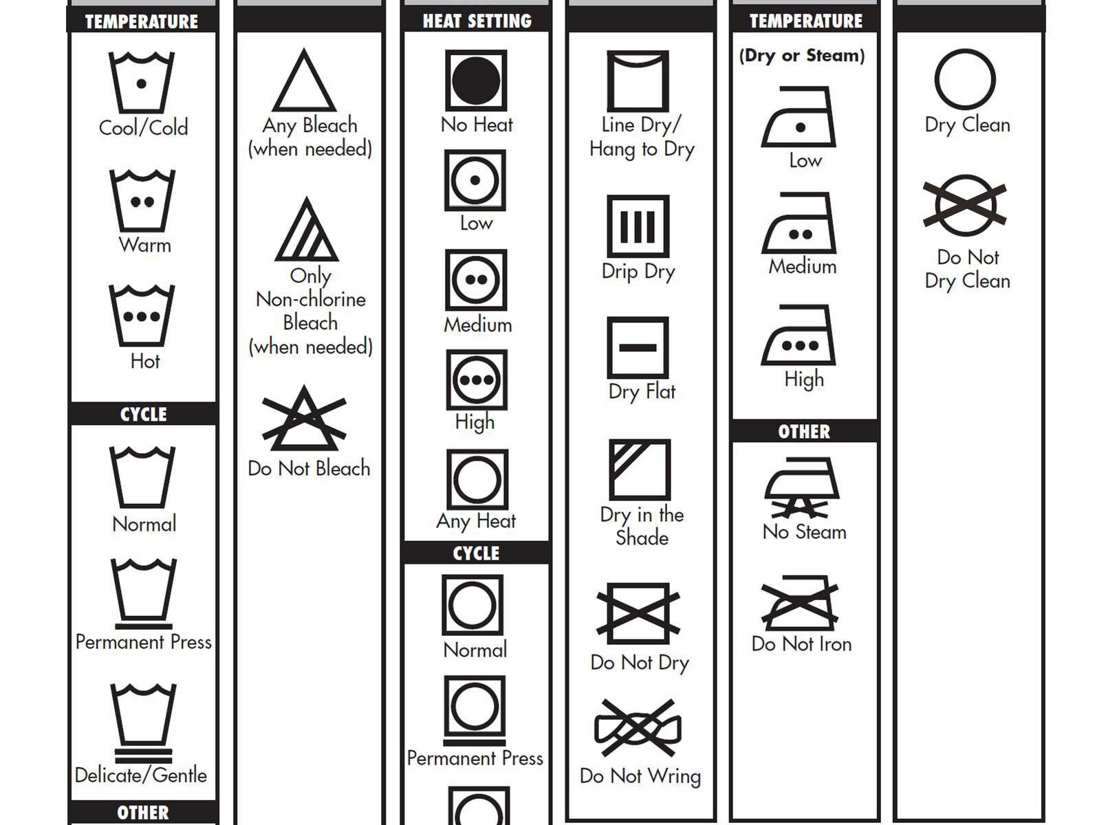
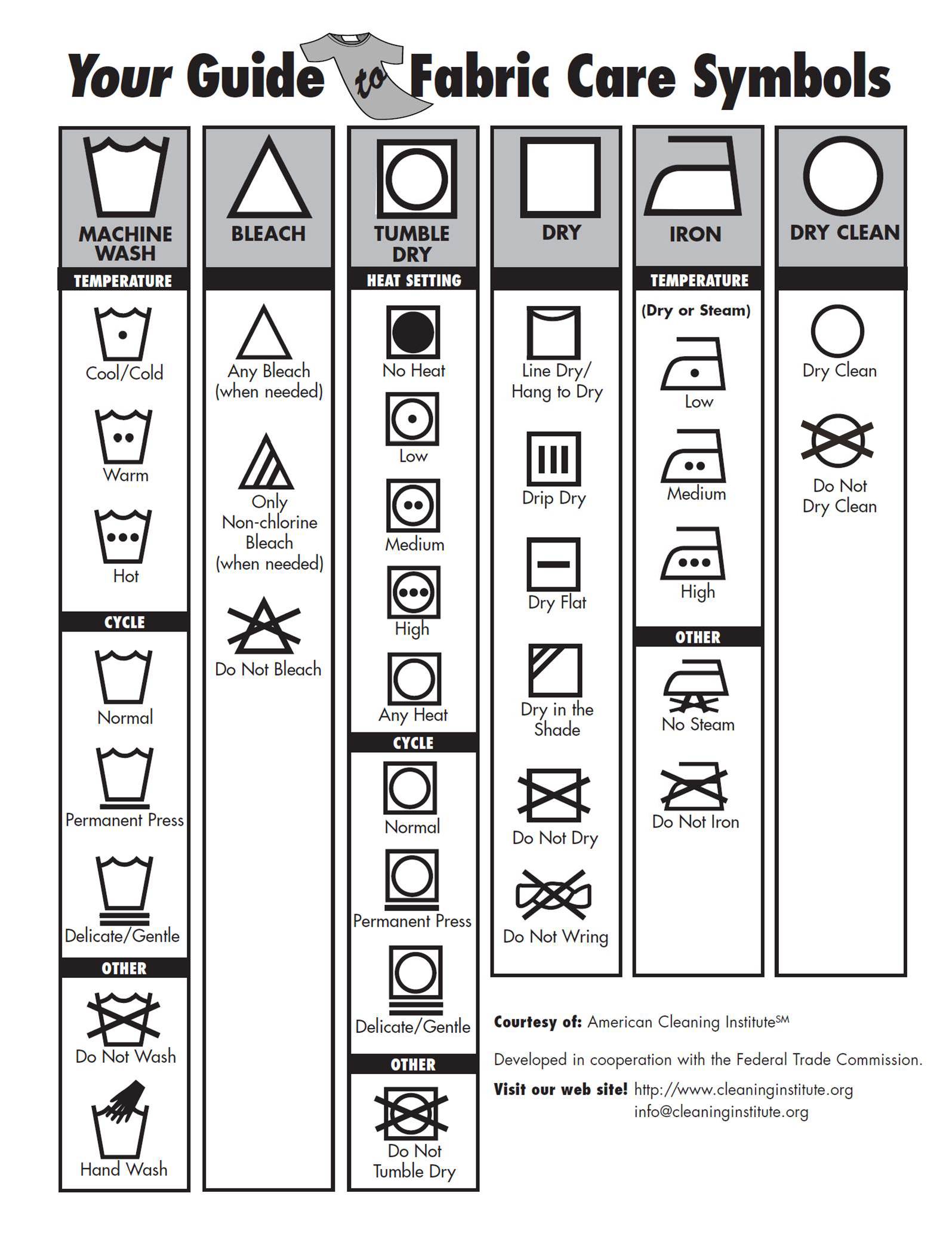
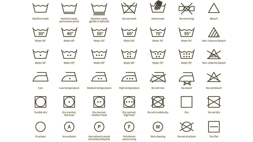
This is the point most frequently misunderstood when specifying interior fabrics. ISO 3758 care symbols, the pictograms showing a washing tub, iron, triangle, and circle, are a garment and textile labelling system. They appear on fabric bolt ends and care labels and cover washing, bleaching, drying, ironing, and dry cleaning. They apply to the fabric as a material.

Upholstery cleaning codes, W, S, WS, and X, are a separate system used on upholstered furniture labels and fabric data sheets. They specify what type of cleaning agent is safe to use on the finished upholstered piece. They apply to the fabric as installed.

A fabric data sheet may show both. The ISO symbols tell you how to care for the fabric before and during upholstery. The cleaning code tells your client how to maintain the piece once it is in use. Both matter and neither substitutes for the other.


The ISO 3758 Care Symbols

Five categories of symbol appear in a standard sequence on every care label: washing, bleaching, drying, ironing, and dry cleaning. A cross through any symbol means that process must not be applied. A single dot or line within a symbol indicates a reduced or gentle setting. Double dots or lines indicate a normal or higher setting.

Fabric Care Symbols
Fabric Care Symbols

Washing symbols use a tub shape. A plain tub indicates machine washing is permitted. A hand in the tub indicates hand wash only. A tub with a cross means do not wash by any method. The temperature appears as a number inside the tub or as dots, with one dot for 30 degrees Celsius, two for 40, three for 60, and four for 95. A single bar beneath the tub indicates a reduced agitation or synthetic cycle. Two bars indicate the delicate or wool cycle.

Bleaching symbols use a triangle. A plain triangle permits all bleaching agents. A triangle with two diagonal lines permits only non-chlorine bleach. A triangle with a cross means do not bleach.

Drying symbols use a square. A circle inside the square indicates tumble drying is permitted. One dot inside the circle means low heat. Two dots mean normal heat. A cross through the circle means do not tumble dry. A square with a single horizontal line in the middle means dry flat. A square with a curved line at the top means line dry.

Ironing symbols use an iron shape. One dot means low heat up to 110 degrees Celsius. Two dots mean medium heat up to 150 degrees. Three dots mean high heat up to 200 degrees. A cross means do not iron. Two lines beneath the iron mean do not use steam.

Dry cleaning symbols use a circle. A plain circle means dry cleaning is permitted using any solvent. Letters inside the circle indicate which specific solvents are safe: F indicates hydrocarbon solvents, P indicates perchloroethylene and hydrocarbon solvents, and W indicates wet cleaning. A circle with a cross means do not dry clean.

ISO 3758:2023 Updates

The 2023 revision of ISO 3758 introduced several additions that may appear on fabric data sheets for recently developed or certified ranges.

A new dedicated hand-wash symbol was formalised, showing a hand inside the washing tub with a temperature indicator. Previously hand washing was indicated by the hand symbol alone without a temperature. The 2023 version allows temperature dots to appear alongside the hand symbol to specify the maximum water temperature for hand washing.

A no-steam ironing symbol was added, shown as an iron with two lines beneath it and a cross, distinguishing it from the general do-not-iron instruction. This allows a fabric to be ironed at low temperature on a dry setting while prohibiting steam, which is relevant for fabrics whose finish or surface texture is sensitive to moisture rather than heat.

The dry cleaning circle was expanded to include the W symbol for professional wet cleaning, recognising the increasing availability of controlled aqueous cleaning processes in specialist laundries as an alternative to traditional solvent-based dry cleaning.

If you are working with a fabric whose data sheet shows symbols you do not recognise, check whether they comply with the 2023 revision before making a cleaning recommendation to a client.

KOTHEA Fabric Care Symbols guide


Fibre Composition Abbreviations

Fabric labels and data sheets state fibre content using standard abbreviations rather than full fibre names. A composition reading “70% CV 30% CA” or “100% PES” is unreadable without the codes. These abbreviations follow the ISO 2076 and EU textile labelling conventions. The common ones an interior designer will meet are as follows.

AbbreviationFibre
COCotton
LILinen (flax)
WOWool
WVVirgin wool (new wool)
WMMohair
WSCashmere
WAAngora
SESilk
PESPolyester
PLPolyester (older code)
PCAcrylic
PANAcrylic (alternative)
PAPolyamide (nylon)
PUPolyurethane (elastane base, coatings)
EAElastane (spandex)
VIViscose
CVViscose (alternative code)
CAAcetate (cellulose acetate)
CMDModal
CLYLyocell (Tencel)

Note that the cashmere code WS is unrelated to the WS upholstery cleaning code covered below. The two systems share the same letters but mean entirely different things: WS on a composition label is cashmere, while WS on a cleaning code means water or solvent cleaning is acceptable.


The Upholstery Cleaning Codes

The W, S, WS, and X codes appear on upholstered furniture labels and fabric specification sheets. They are the system your client’s housekeeper or cleaning contractor needs to know.

W means water-based cleaning only. Use a water-based shampoo or upholstery cleaner with a clean cloth. Do not use solvent-based cleaners as these may damage the fabric or its backing. Most synthetic fabrics and many treated natural fibres carry a W code.

S means solvent-based cleaning only. Use a dry-cleaning solvent. Do not use water as it can cause shrinkage, watermarks, or damage to the fabric structure. Fabrics carrying an S code include many untreated natural fibres, velvets, and fabrics with water-sensitive finishes.

WS means either water-based or solvent-based cleaning is acceptable. This is the most versatile code and indicates a fabric that can tolerate both cleaning methods depending on the nature of the stain.

X means vacuum or light brushing only. No liquid of any kind should be applied to the fabric. Fabrics carrying an X code are typically fragile, water-sensitive, or finished in a way that would be irreversibly damaged by any liquid. For serious staining on an X-coded fabric, a specialist conservation cleaner should be engaged.


Velvet Upholstery

Velvet requires specific care guidance beyond the standard codes. The pile direction of velvet affects both its appearance and how it responds to cleaning. Always work in the direction of the pile when applying any cleaning agent or when brushing. Cleaning against the pile can cause permanent crushing or an apparent change in colour.

For mohair velvet, dry clean only is the standard recommendation for serious soiling. Spot cleaning with a barely dampened lint-free cloth is acceptable for minor fresh stains, working in the direction of the pile. Water should not be applied heavily as it can cause watermarks or pile matting. For full care guidance see our post on cleaning and maintaining mohair velvet.


FR Treatment and Cleaning

If a fabric has been topically treated with a fire-retardant finish to achieve a Crib 5 pass, cleaning can degrade the treatment. Dry-cleaning solvents in particular can strip a back-coating. The treatment provider should be consulted before any cleaning regime is recommended to a client for a topically treated fabric. Inherently fire-retardant fabrics, such as mohair velvet with an inherent Crib 5 pass, are not affected by this issue because the fire resistance is a property of the fibre itself rather than an applied coating.


Quick answers

What is the abbreviation for polyester on a fabric label?
Polyester is abbreviated PES on fabric composition labels, following ISO 2076 and EU textile labelling conventions. An older code, PL, is also sometimes seen. A label reading 100% PES means the fabric is entirely polyester. These fibre codes are separate from the ISO 3758 care symbols and the W, S, WS, X cleaning codes, which describe how to clean the fabric rather than what it is made of.


What does CA mean on a fabric composition label?
CA stands for acetate, specifically cellulose acetate, a fibre made from processed cellulose. It is used for linings, faux silks, and decorative fabrics for its lustre and drape. On a composition label such as 70% CV 30% CA, the CA portion is acetate and the CV portion is viscose. Acetate is heat-sensitive and usually requires dry cleaning; check the ISO care symbols on the label before cleaning.


What do the fibre abbreviations on a fabric label mean?
Fabric composition is stated using standard fibre abbreviations rather than full names. Common codes include CO for cotton, LI for linen, WO for wool, WV for virgin wool, WM for mohair, WS for cashmere, SE for silk, PES for polyester, PC or PAN for acrylic, PA for polyamide or nylon, VI or CV for viscose, and CA for acetate. These follow ISO 2076 and EU textile labelling conventions and describe what the fabric is made of, separately from the care symbols and cleaning codes that describe how to maintain it.


What do the letters W, S, WS, and X mean on an upholstered sofa label?
W, S, WS, and X are upholstery cleaning codes that indicate what type of cleaning agent is safe for the fabric. W means use water-based cleaners only. S means use solvent-based dry-cleaning agents only. WS means either method is acceptable. X means vacuum or brush only, with no liquid of any kind. These codes are separate from the ISO 3758 care symbols on fabric labels and apply specifically to the maintenance of the finished upholstered piece in use.

Can you use water to clean a velvet sofa?
Only if the sofa fabric is coded W or WS. A velvet sofa labelled S must be cleaned with a dry-cleaning solvent only. Water applied to an S-coded velvet can cause watermarks, pile matting, and permanent colour change. For a sofa coded WS, a very lightly dampened lint-free cloth worked in the direction of the pile is acceptable for fresh minor stains. Always test any cleaning method on an inconspicuous area first and allow to dry fully before assessing the result.

What does a cross through a care symbol mean on a fabric label?
A cross through any ISO 3758 care symbol means that process must not be applied to the fabric. A cross through the washing tub means do not wash by any method. A cross through the iron means do not iron. A cross through the tumble dry circle means do not tumble dry. A cross through the dry cleaning circle means do not dry clean. When a cross appears, applying that process would damage the fabric and the instruction must be followed precisely.

What is the difference between care symbols on a fabric bolt and the cleaning code on a sofa label?
Care symbols on a fabric bolt follow ISO 3758 and cover washing, bleaching, drying, ironing, and dry cleaning of the fabric as a material. The cleaning code on a sofa label, W, S, WS, or X, is a separate system that specifies what cleaning agent is safe for the fabric as an installed upholstered piece. Both systems are relevant to interior fabric specification and aftercare advice, but they serve different purposes and apply at different stages of the fabric’s life.

Does dry cleaning a fabric remove a Crib 5 fire treatment?
For fabrics with a topical Crib 5 fire treatment, dry-cleaning solvents can degrade or remove the back-coating that provides fire resistance. Before recommending any cleaning regime for a topically treated fabric, confirm the appropriate method with the FR treatment provider. Fabrics with an inherent Crib 5 pass, such as mohair velvet, are not affected by this issue because the fire resistance is a property of the fibre itself and is not removed by cleaning.

What is the cleaning code for mohair velvet upholstery?
Mohair velvet upholstery is typically coded S, meaning solvent-based dry-cleaning agents only. Water applied directly to mohair velvet can cause watermarks, pile matting, and an apparent change in colour that is difficult or impossible to reverse. For minor fresh stains, a barely dampened lint-free cloth worked in the direction of the pile is acceptable as a first response. Any serious soiling should be referred to a specialist dry cleaner with experience of velvet upholstery.

What is the cleaning code for faux leather upholstery?
Faux leather upholstery is typically coded W or WS, meaning water-based cleaning is safe and in most cases the preferred method. A clean damp cloth is the standard approach for PVC and PU faux leathers. Avoid harsh solvents unless specifically confirmed as safe by the manufacturer, as some solvent-based agents can damage the surface coating or cause discolouration over time.

How do you clean linen upholstery fabric?
Most upholstery linen is coded S or WS depending on the specific range and finish. Pre-washed linen is generally more tolerant of spot cleaning with a water-based solution than untreated linen. Always confirm the cleaning code on the fabric data sheet before advising a client. Linen should never be saturated with liquid and should be dried naturally without applied heat to avoid shrinkage.

What happens if you use water on a fabric coded S?
Applying water to a fabric coded S can cause irreversible damage including watermarks, shrinkage, pile distortion in velvets, and loss of surface finish. The S code indicates that the fabric structure or finish is sensitive to water and that only dry-cleaning solvents are safe. If water has been applied accidentally, blot immediately without rubbing, allow to dry naturally, and consult a specialist upholstery cleaner before taking any further action.

What does dry clean only mean for an upholstered piece?
Dry clean only on an upholstered piece corresponds to the S cleaning code and means only solvent-based cleaning agents should be used. For upholstered pieces that cannot be removed and taken to a dry cleaner, a specialist in-situ upholstery cleaning service should be engaged. These services apply solvent-based agents on location without saturating the fabric or the foam beneath it.

How do you read care symbols on a fabric data sheet?
Care symbols on a fabric data sheet follow ISO 3758 and appear in a fixed sequence from left to right: washing, bleaching, drying, ironing, and dry cleaning. A cross through any symbol means do not apply that process. Numbers or dots inside the washing tub indicate the maximum temperature in degrees Celsius. A bar beneath the tub indicates reduced agitation. These symbols describe how to care for the fabric as a material. The cleaning code, W, S, WS, or X, is listed separately and describes how to maintain the finished upholstered piece.

Can you iron velvet upholstery fabric?
Velvet should not be ironed directly. The heat and pressure of an iron will crush the pile permanently. The care label for velvet will typically show a cross through the iron symbol or, at most, a single-dot low-heat symbol with the instruction to iron on the reverse only. If velvet requires refreshing after crushing or creasing, holding a steam iron a few centimetres above the surface and brushing gently in the direction of the pile is the recommended method. Do not allow the iron to make contact with the fabric face.

Does washing a fabric remove its Crib 5 fire retardant treatment?
Repeated washing can degrade the back-coating of a topically treated Crib 5 fabric over time. The BS 5852 standard includes a water-soak test as part of full certification, meaning a certified fabric has demonstrated resistance to a single water soak, but this does not guarantee indefinite resistance to repeated cleaning. Always confirm the recommended cleaning method with the treatment provider for topically treated fabrics. For inherently Crib 5 fabrics such as mohair velvet, the fire resistance is a property of the fibre and is unaffected by cleaning.


Request Samples

Order cutting samples of any fabric from our current collections. Trade accounts only.

Order Cuttings