
Colour in Interior Design: Naming, Communication, and Specification
The specification problem: Colour names are commercial and subjective. The same underlying colour has dozens of different names across suppliers, paint brands, and clients — and no two designers will necessarily agree on what duck egg means.
The solution: Always resolve to a colour system reference — NCS for interior surfaces, RAL for metal finishes, Pantone for print and brand work — before ordering.
The hidden risk: Metamerism. A fabric that matches in the showroom under daylight may not match under the artificial light in the finished room.
The translation table below groups common UK interior design colour names by the underlying colour they typically describe, as used in 2026.
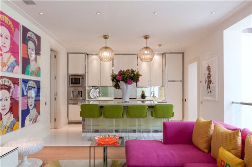
Colour is the specification decision most likely to cause a client complaint and the one most rarely handled with precision. A client approves a fabric described as blush. The designer orders a paint described as petal. The upholsterer sources a trim described as powder pink. All three are different colours. The scheme arrives on site and nothing matches because no one resolved the name to a number.
This guide covers how colour naming works and why it fails, which colour system to use and when, how to communicate colour precisely across trades, and why the same colour looks different to different people and in different light. The translation reference below groups the most common UK interior design colour names by colour family, as of 2026.
Why Colour Names Fail
Every fabric house, paint brand, and tile supplier names its own colours. The names are chosen for commercial appeal, not precision. A paint company wants Elephant’s Breath to evoke warmth and character. A fabric house wants their Biscuit to suggest luxury neutrality. Neither name tells you where the colour sits in any colour space. Both names could plausibly describe a wide range of warm mid-toned neutrals.
The problem compounds across a project. A designer specifying a scheme involving fabric from one supplier, paint from another, carpet from a third, and joinery from a fourth is working across four independent naming systems. There is no cross-reference between them. The only way to align them is to resolve every colour to a shared external reference — a colour system number — and communicate that number to every trade.
Even within a single supplier’s range, names shift. A fabric house that has offered a colour called Midnight for ten years may reformulate the dye lot, slightly alter the weave, and produce a Midnight that is measurably different from the one specified two years earlier. The name is the same. The colour is not.
The naming problem is also cultural. British designers use colour names that reflect a particular historical and landscape vocabulary — stone, slate, chalk, flint, pewter, linen, dove. American designers use a different vocabulary. European designers working in the Nordic tradition use the NCS system. A project involving international suppliers requires an explicit colour system reference to avoid compounding the naming problem across languages as well as trades.
Colour Systems: Which to Use and When
NCS — Natural Color System. The most useful colour system for interior design specification. NCS describes colours in terms of how they are perceived by the human eye, using six elementary visual colours: white, black, red, yellow, green, and blue. An NCS code such as S 3020-Y50R specifies blackness (30%), chromaticness (20%), and hue (50% toward red from yellow). The S prefix indicates the second edition of the standard. NCS is used by architects and interior designers across Europe and is the reference standard for major paint manufacturers including Jotun and Dulux Trade in their professional ranges. When specifying wall colours for a commercial interior project, NCS is the correct system to use. It allows you to communicate a precise colour to a painter, a fabric supplier, and a joinery manufacturer without relying on any of their proprietary names.
RAL. The European standard for powder coating, metalwork, and architectural finishes. RAL Classic uses four-digit codes covering approximately 215 colours. RAL 9016 is Traffic White. RAL 7016 is Anthracite Grey. When specifying metal chair frames, radiators, window frames, or any powder-coated architectural element, RAL is the correct system. Most powder coating suppliers work from RAL as their primary reference. RAL does not map directly to NCS or Pantone without conversion, and conversions are approximate rather than exact.
Pantone. The dominant colour system in graphic design, brand communication, and print production. Pantone codes are used when specifying a brand colour for print, signage, or product. In interior design, Pantone is occasionally used as a colour reference for upholstery and wallcovering suppliers who offer Pantone matching, but it is not the primary system for architectural finishes. Pantone codes appear on printed swatches and fabric samples but should not be used as the sole colour reference for a painted surface, as the translation from ink to paint is approximate.
BS 4800. The British Standard colour specification for paints used in building work. BS 4800 covers a defined set of colours identified by a code such as BS 4800 10 A 03 (a warm off-white). It is used primarily in public sector and heritage projects where British Standard compliance is specified. Many general contractors and architects working on commercial buildings in the UK will be familiar with BS 4800 references. It is a smaller palette than NCS and less commonly used for bespoke or high-design interiors.
The practical rule is: use NCS for all wall, floor, and soft furnishing colour communication on interior design projects. Use RAL for metalwork and powder-coated elements. Obtain both references where possible so that trades working in either system can match without conversion.
Metamerism: Why the Colour That Matched in the Showroom Looks Wrong on Site
Metamerism is the phenomenon by which two surfaces that appear identical under one light source appear different under another. It is one of the most common causes of colour-match complaints on interior design projects and one of the least discussed with clients in advance.
The reason it occurs is that two surfaces can reflect the same amount of light to the eye under one type of illumination while having different underlying spectral profiles. Under a different light source, the differences in spectral profile become visible. A fabric and a paint that match perfectly under the daylight of a showroom window may look visibly different under the warm tungsten halogen downlights in the finished room. Both colours are correct. The light source changed the relationship between them.
Metamerism is particularly common between natural and synthetic materials. A mohair velvet and a painted wall that match under daylight are likely to show metameric shift under artificial light because natural fibre dyes and paint pigments have different spectral curves. It is also common between fabrics from different fibre types — a cotton and a polyester in the same colourway may match under daylight and diverge under artificial light for the same reason.
The practical response is to view all fabric samples and paint samples together under the artificial light sources specified for the finished room before approving the scheme. This means reviewing the lighting specification in advance and obtaining the same lamp type for the sample viewing. Most clients and many designers view samples in daylight or under office fluorescent lighting and assume the match will hold. It often does not.
For high-stakes colour matching — a large hotel project where hundreds of chairs must match a specified wall colour across multiple rooms — commission a formal metamerism assessment from a testing laboratory before committing to production quantities.
Colour Perception Differences Between People
Approximately 8% of men and 0.5% of women have some form of colour vision deficiency. The most common type is red-green deficiency, in which the receptor cells that distinguish red from green are absent or abnormal. A person with this condition perceives red and green as variations of the same brownish yellow. This is not a minor variation — it is a fundamental difference in how approximately one in twelve male clients perceives the fabric palette a designer is presenting.
Colour vision deficiency is frequently undiagnosed. Clients who have lived with it since birth have developed compensatory strategies and may not disclose it or may not know they have it. A designer who presents a scheme relying on contrast between red-toned and green-toned neutrals — terracotta versus sage, for example — may be presenting a scheme the client cannot see as intended.
Beyond clinical deficiency, there is significant variation in how people with normal colour vision name and categorise colours. Studies have shown that colour naming is culturally and linguistically variable — what one language group calls blue, another language group divides into two separate colour categories. Two designers with normal colour vision looking at the same fabric may describe its undertone differently, and both will be accurately reporting what they see. The human visual system is not a calibrated instrument. It is a perception system shaped by language, culture, expectation, and the colours surrounding the object being observed.
In practice, this means that verbal colour descriptions are unreliable between any two people unless they are standing in front of the same physical sample under the same light at the same time. The specification implication is the same as for naming: resolve to a colour system reference and communicate physical samples, not verbal descriptions or digital images.
Colour Translation Reference: Common Interior Design Names by Family (2026)
The following groups the most frequently used colour names in UK interior design, upholstery, and decorating as of 2026, organised by the underlying colour they typically describe. Names within each group are not identical — they occupy overlapping but distinct territory — but they are commonly used interchangeably by clients, designers, and suppliers who do not share a colour system reference. The groups are a starting point for conversation, not a claim of equivalence.
Whites and near-whites. Brilliant white, pure white, chalk white, off-white, cloudy white, old white, linen white, ivory, cream, antique white, aged white, bone, parchment white, ceramic white, architectural white. These names span a wide range from cold blue-whites through warm cream-whites. A client who asks for cream and a client who asks for ivory may be describing colours a full tone apart. Always show physical samples.
Warm greiges and neutral taupes. Greige, warm grey, stone, putty, linen, parchment, oatmeal, mushroom, taupe, mole, beige, buff, calico, string, natural, jute, raffia, hessian, wheat, biscuit, driftwood, pale stone, light stone, warm stone. This is the most densely populated territory in UK interior design naming and the one most prone to miscommunication. Greige alone is used to describe colours ranging from pale warm beige to mid warm grey. Always resolve to NCS before specifying in this family.
Cool greys. Silver, lead, slate, pewter, gunmetal, graphite, charcoal grey, payne’s grey, dove grey, ash grey, mist grey, flint, pebble, smoke, zinc, concrete grey, storm grey, elephant grey, mouse. The warm-cool axis within grey is the primary source of mismatch in this family. A warm grey specified by a designer may read as brown against the cool grey chosen by a contractor for metalwork. NCS or RAL references resolve this.
Blue-greens and aquas. Duck egg, teal, peacock, kingfisher, jade blue, lagoon, aqua, eau de nil, mineral blue, verdigris, turquoise, malachite, sea green, ocean, petrol, airforce blue (with green undertone). Duck egg and teal are used interchangeably by many clients but occupy different positions — duck egg is typically a pale, muted blue-green and teal is a deeper, more saturated blue-green. Eau de nil is greener and paler than both. These distinctions are lost without a physical sample or a colour system reference.
Blues. Navy, midnight blue, ink, indigo, denim blue, storm blue, petrol (with blue undertone), prussian blue, french navy, cobalt, ultramarine, cornflower blue, wedgwood blue, china blue, powder blue, pale blue, sky blue, dusk blue, twilight blue, deep sea. Navy alone covers a range from near-black blue-black through mid blue-navy to softer slightly lighter navies. Ink and midnight typically sit at the dark end. Wedgwood and china blue sit at the lighter, cooler end.
Greens. Sage, eucalyptus, olive, khaki, moss, fern, forest green, hunter green, racing green, bottle green, dark green, heritage green, military green, lichen, oregano, artichoke, willow, soft sage, pale sage, mint, jade, malachite, emerald, jungle, avocado, apple green, pistachio. Sage is the most widely misapplied name in UK interiors. It is used to describe everything from pale grey-green through mid green-grey to distinctly green muted mid-tones. A client who asks for sage may mean any of twenty different colours.
Pinks and blushes. Blush, dusty rose, dusky pink, rose, antique rose, petal, old rose, powder pink, nude, flesh, ballet pink, candy pink, shell pink, dawn pink, cameo, clay pink, terracotta pink, blossom, peach blush, pale copper. Blush and dusty rose are frequently used as synonyms but blush typically carries a lighter, more pink tone while dusty rose sits further toward red-pink with more grey. Peach blush crosses into the orange-pink territory that can read as terracotta under warm artificial light.
Terracottas and clays. Terracotta, rust, burnt orange, sienna, burnt sienna, copper, brick red, clay, adobe, paprika, spice, cinnamon, ginger, saffron, turmeric, ochre-red. Terracotta has shifted considerably in UK design usage over 2023 to 2026, moving from a darker burnt clay toward lighter, more muted clay pinks. A fabric specified as terracotta in 2019 and a fabric specified as terracotta in 2026 may be visibly different colours.
Ochres and mustards. Ochre, mustard, turmeric, gold, amber, honey, sand, straw, hay, maize, sunflower, chartreuse (warm end), saffron, golden yellow, aged gold, antique gold, harvest. Mustard and ochre are frequently confused. Ochre is typically a more muted, earthy yellow-brown. Mustard is warmer and more saturated. Honey sits between them. Gold crosses into metallic territory that is distinct from pigment-based versions of the same tone.
Browns and taupes. Tobacco, chocolate, mahogany, walnut, chestnut, caramel, mocha, coffee, cocoa, espresso, bark, sepia, burnt umber, raw umber. Taupe, mole, beaver, warm stone, fawn, doeskin, camel, vicuna, praline, hazel, truffle. The brown-taupe family is split between the red-brown furniture tones (walnut, mahogany) and the cooler grey-brown neutrals (mole, taupe, beaver). A client who asks for camel may mean anything from a warm tan through to a dark golden brown depending on their reference point.
Blacks and near-blacks. Jet black, pure black, soft black, charcoal, anthracite, gunmetal, ink, pitch, ebony, onyx, carbon, slate black, warm black, blue-black, off-black. Off-black and near-black have become a significant design category in UK interiors. Railings (blue-black), Downpipe (blue-grey-black), and similar deep tones occupy different positions on the warm-cool axis within apparent black and will not match each other on site.
Frequently Asked Questions
What is the difference between duck egg and teal?
Duck egg is typically a pale, muted blue-green with significant whiteness — it reads as a soft, quiet colour in most rooms. Teal is deeper and more saturated, with a stronger blue-green chromatic content. Some suppliers use the names interchangeably, which makes them unreliable without a physical sample. Eau de nil sits to the greener, paler side of duck egg. Petrol sits to the darker, bluer side of teal. Always view physical samples side by side rather than ordering from name descriptions alone.
What does greige mean?
Greige is a portmanteau of grey and beige, describing a neutral that sits between the two. It has become one of the most popular colour families in UK interior design since approximately 2018 and is heavily used in both residential and hospitality specification. The problem is that different suppliers use greige to describe colours spanning a significant range — from pale warm beige with barely perceptible grey, through to mid warm grey with beige undertones. There is no standard definition. Always request a physical sample and resolve to an NCS reference before ordering.
What colour system should interior designers use?
NCS is the most appropriate colour system for interior design specification in the UK and Europe. It describes colours in terms of visual perception, is used by major paint manufacturers in their professional ranges, and allows precise communication across trades without relying on proprietary colour names. RAL should be used for metalwork, powder coating, and architectural hardware. Pantone is appropriate for brand colour communication and print. BS 4800 applies to public sector and heritage projects with British Standard requirements. Always obtain an NCS reference for any colour that will be matched across multiple suppliers or trades.
What is metamerism and how does it affect fabric specification?
Metamerism is the phenomenon by which two surfaces that appear identical under one light source appear different under another. In interior specification, it most commonly occurs when a fabric approved in daylight in a showroom does not match the paint or other materials under the artificial lighting of the finished room. The underlying colours are correct — the light source changed the relationship between their spectral profiles. To avoid metameric mismatches, always view fabric and paint samples together under the same light source as the finished room before approving a scheme. For large-scale projects, a formal metamerism assessment can be commissioned from a testing laboratory.
What is sage green?
Sage is one of the most widely misapplied colour names in UK interior design. It is used by different suppliers and clients to describe colours ranging from pale grey-green (barely green, primarily grey) through to distinctly green mid-tones with visible chromatic content. The common territory is a muted, greyed green — a green that has been reduced by the addition of grey or its complementary colour until the green is soft rather than vivid. Eucalyptus, willow, and soft sage typically sit at the paler, more muted end. Lichen and oregano sit at the more complex, multi-toned end. Always use a physical sample and NCS reference when specifying any green in this family.
Why do colours look different to different people?
Two main reasons. First, approximately 8% of men and 0.5% of women have colour vision deficiency, most commonly red-green deficiency, in which red and green are perceived as variations of the same brownish tone. This is frequently undiagnosed. Second, even among people with normal colour vision, colour naming is variable — shaped by language, culture, and prior experience. Two designers with identical colour vision may describe the same fabric undertone differently and both are accurately reporting their perception. The implication for specification is consistent: verbal descriptions and digital images are unreliable. Physical samples under agreed lighting conditions are the only reliable basis for colour approval.
For guidance on colour fastness and how fabric colours perform over time, see our colour fastness and crocking guide and our light fastness and Blue Wool Scale guide.
Request Samples
Order cutting samples of any fabric from our current collections. Trade accounts only.
Order Cuttings