When choosing a fabric for upholstery think about the finished sofa.
If you are planning to have piping (made by rolling the fabric) then make sure that your chosen fabric can be used in that way. It is sometimes hard to roll thicker fabric.
Also bear in mind that your upholsterer might be overly cautious. So, for example, people are often told that some Mohair Velvets cannot be used for piping when they usually can.
When your newly ordered fabric is delivered it will have the face rolled on the inside. This makes sense when you think about it. The roll will be transported and any damage caused during transit will be made first to the outside and that, when unrolled, will be the reverse/back of the fabric. So if there is minor damage the fabric can still be used.
However, if you fabric arrives and damage is apparent then:
1. Don’t cut it; and
2. Either reject it or get the courier to note the damage.
Ensure that the sample you have is the right way up. Mistakes are made. It could be back to front or rotated 90/180 degrees. Sometimes it is NOT obvious so check with the supplier.
If you are specifying upholstery fabric (especially) in a contract environment then look closely at the Martindale or rub test rating of your fabric. This measures abrasion and simulates ‘wear and tear’.
The following is taken from BS 2543 and shows the ‘intended duty’ of the fabric:
OD = Occasional domestic – 6,000 rubs
LD = Light domestic – 15,000 rubs
GD = General domestic – 20,000 rubs
HD = Heavy domestic – 25,000 rubs
SD = Severe domestic/general contract – 30,000 rubs
SC = Severe contract Abrasion performance – 40,000 rubs
Rather than saying “Please can I order 24m of your black mohair velvet” be more specific to your requirements stating that, for example, you need 8 drops of 3m for wall panelling. This can sometimes even help the supplier as they know they can give you (from the same batch) some of the smaller lengths that they would not otherwise sell.
Don’t forget to order more fabric than you need, especially with upholstery. 10% is often enough. With curtains/blinds/walling you can calculate your drops more accurately.
Don’t forget some fabrics shrink when washed, others shrink when treated. Your upholsterer/curtain maker might make a mistake and replacement or additional fabrics might be from a different batch (i.e. different! not good).
Faults are a natural ‘feature’ of very many fabrics. No-one should expect you to pay for these and fabric companies will give you extra to compensate. However where the fault precisely occurs in the cut/roll is ‘random’ and although the fabric company may have given you extra the cuts you need to make might not work out. (See Fabric Tip #3)
In a contract environment. Specify Crib 5 treatment for your fabrics.
Sometimes this is also referred to as “Ignition Source 5” and it is appropriate for MEDIUM HAZARD environments like hotels. This excludes more extreme environments like certain hostels and off shore installations and hospitals.
Great Web Sites are important for Interior Designers. Often they are just too great-looking and neglect to do a proper all-round job.
As an Interior Designer you have a web site for numerous reasons, those reasons will almost exclusively be related to sales & marketing.
Your web site must personify your brand at its highest level, it should probably showcase your work and maybe it should showcase some of the talents of your most trusted and valued staff. It must look wonderful.
So far so good?
Click To Read More Interior Design Articles
I can show you many sites where Interior Designers have done just that. They have produced the most amazing works of art almost.
But why? I’m not saying it is wrong to do that I ‘m just asking why have you focused all your efforts on creating a work of art? Who exactly is going to see it? Where is the audience to your work of art? Who is the audience? What is the purpose?
Often the web design agency have made matters worse. Their creative staff have wanted to do just that; be creative. There is much merit in creativity but only as part of what your customers are looking for.
Maybe the web site has to look good to make your staff or management proud of working in your organisation. That’s a valid reasons too, in part.
Has anyone considered your potential customers? Your existing customers? Has anyone considered at what moments in the customer’s decision making process they are likely to look at any given part of your web site? Definitely not in many cases.
Ask: “How have your (potential-) customers got your web site address?” If it is from your business cards then the role your web site should play at that time is to support the image, the brand journey you have already started to create with them. If the customer is a longstanding one then they may visit your web site as a sort of post-purchase gratification – maybe they want the project you did for them showcased to the world? If it is a potential customer, that you have not yet even contacted, then they have probably got your web address from a search engine. They will need some degree of showcasing BUT these potential new clients are looking for information, something to make them more interested in your company and they need something to make them be reassured of, and desirous for, your services.
So you’ve probably done a lot right in creating a tool to help the sales process along but you have probably not also created a marketing tool that plays a significant enough role in new lead generation.
What, in detail, have you done wrong then? (not you, sorry, those other interior designers!). Most of these are really very important points and not just designed to make up a list:
1. Publically invisible – there are a lack of quality inbound links to your website;
2. Picture rich, Word poor – insufficient content/information on your web site, instead you have too many nice images;
3. Gorgeously bland – if you changed the name of your company on your web site to that of your biggest competitor would anyone really notice? Do you share their language? When you write in media-speak you do not differentiate your company from anybody else. You are marketing yourself in the same way as everyone else, if that is true then you are trying hard to be average!;
4. Lost in space – your site should be easily navigable, leading visitors from one thoughtful insight to the next breathtaking interior (or at least to the contact page). On several interior designer sites I have visited the first page presented has no obvious form of navigation to suggest where to go next;
5. Even the IT guy got confused – lack of meta-tag and headings, too much flash-content that search engines cannot see at all; and
6. Hide and seek – lack of search functionality. Without search on your site you are making it as hard as possible for your potential customers to find what they want. They will be used to using a search engine for finding information – just like you are.
There are more things interior designers do wrong with their web sites but those are ones that should be rectified ASAP.
So what exactly should you do? I’ll answer that by answering the ‘mistakes’ listed above:
1. Get quality inbound links. This is a traditional PR exercise but applied to digital media rather than print media. You want links from sites with a higher page rank than your site’s page rank NOT reciprocal links. Find out what pagerank is and put some time into creating inbound links, at first play catch up by seeing what some of your best competitors do (not KOTHEA, we are not a competitor)
2. More content: describe what you do and how you do it and why you do it. Google rates your site based on this type of content rather than pretty picture content.
3. Speak in plain, conversational English. You are not a management consultant, although your client might be.
4. Get your friends or kids (even better clients) to work through your site and watch them do it without helping. Getting around should be intuitive. Also think about the term “call to action”, wherever your potential client is on your site there should be an obvious call to action, an obvious thing for them to do next such as sending you an email or telephoning you for a brochure or appointment.
5. Keep the nice flash bits if you have them but get your IT guys to talk to you about meta tags/keywords, titles, sitemaps, and h1/h2 tags. (Actually get them to JUST talk to you about those first of all and as soon as they mention web 2.0 just glaze your eyes over and pretend you don’t want to understand! That’s next month’s marketing job for you, don’t let them distract you!). Look puzzled and concerned when they tell you why some of these technical bits are just not possible on your site (they are not being fully truthful) and then ask them why the site was designed and implemented like it was as surely that is the cause of the problem. with the exception of inbound links, all of the things on this list really should have been done when your site was designed and built, I would almost say that if they were not done then they should be corrected for free if they were done by a paid ‘expert’.
6. Introduce site search. This can cost thousands or it can be free. It depends who you talk to!
I hope that helps. These really are genuine, important problems with many sites and not just an excuse for me to write another list. You can read more of my articles on the business of interior design <here> the articles tend to be about sales and marketing issues rather than technology though I answer questions on either!
PS: This following link is written by Google, it covers related areas of interaction between you and your potential online customer. It is more geared towards selling over the web but you will get the idea of what you should be doing by inference: https://www.google.co.uk/intl/en/landing/conversion/ebook.html

 Be really sure what you are buying.
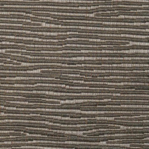 If you are specifying upholstery fabric (especially) in a contract environment then look closely at the Martindale or rub test rating of your fabric. This measures abrasion and simulates ‘wear and tear’.
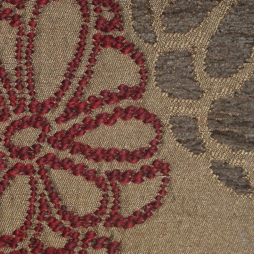 Be precise about what lengths you need.
 Don’t forget to order more fabric than you need, especially with upholstery. 10% is often enough. With curtains/blinds/walling you can calculate your drops more accurately.
 BETTER FIRE SAFETY
